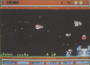
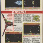
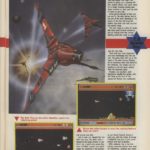
It seems like Commodore User magazine were a little naughty with their Nemesis review back in the 80’s.
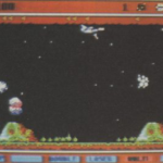
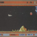
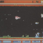
Featuring screenshots from what seem to be an earlier version of the game – just look at the brown/orange score panels, which were dropped for something that looked a lot better in the final release.
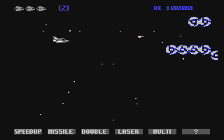
At least they reviewed a working version of the game, compared to sister magazine Sinclair User, who reviewed mock up screenshots. Seemed to be a theme at the publisher though…
Here is the review and all the screenshots, thanks to Martin/Stadium 64 for highlighting it!
